 I chose the Snow Leopard to create because I love cats and I wanted to do another low poly edit in class. After the first one I made in class really made me love art and photography. I like my final piece but it wasn’t better than the first one I did. The first Low Poly I did had a lot more meaning behind it than this one. The Hardest aspect of Image to manipulate was making sure the blur affected all colors and not just be a grey blob. So to get around this is did all the colored spots on the Leopard very small triangles to show of its color more. Advice I would give to another student is to be patient and do everything carefully.
Jesse, Lets cook.
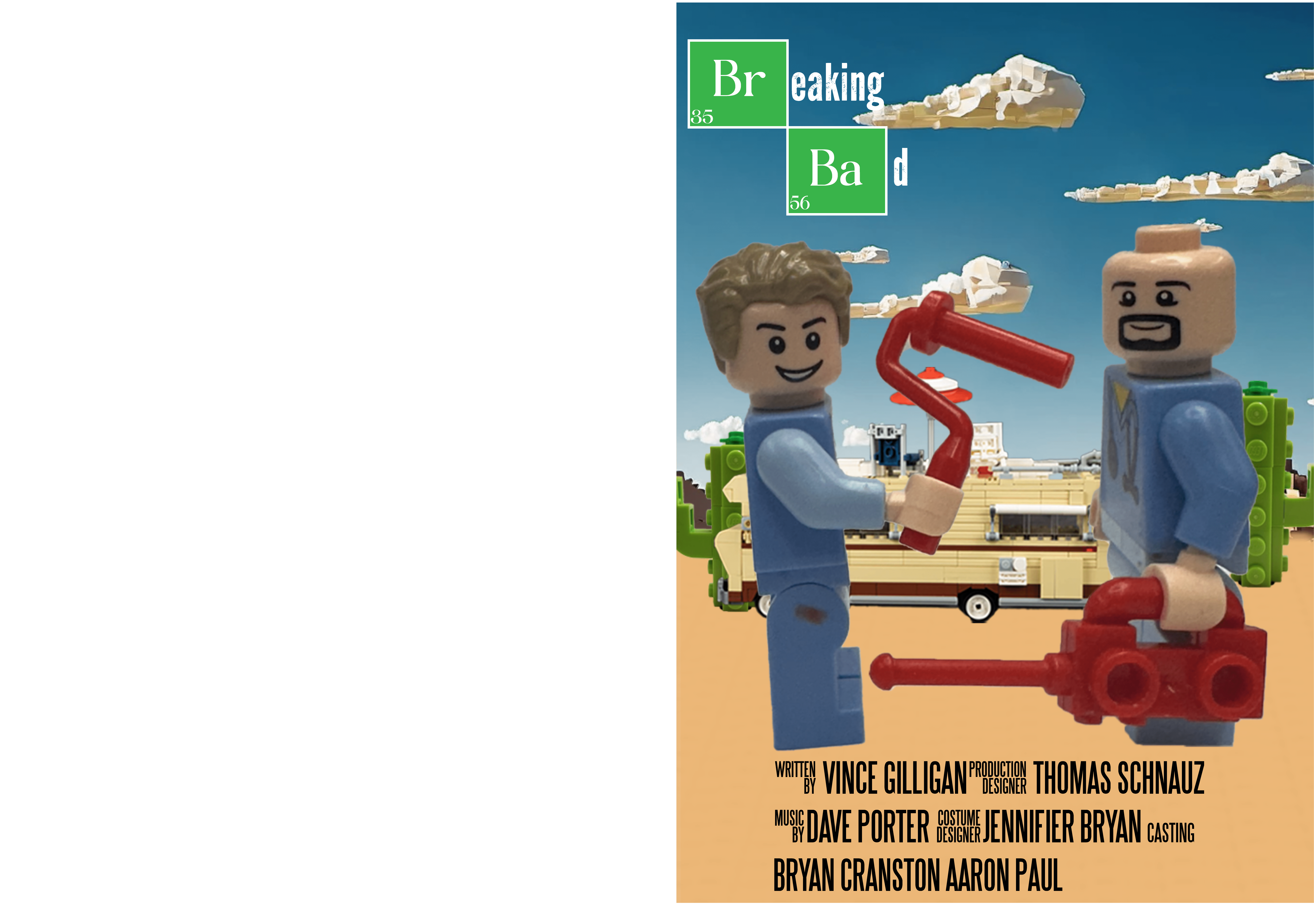 I chose this Breaking Bad poster to recreate because I love the show. The story and great foreshadowing in the show is the best I’ve seen to date. This show really changed my life and is really one of my favorites of all time. I love how the background and the title turned out in the final edit. I think I did a really good job recreating the environment. And the title looks like it was from the original. The hardest part was to recreate the environment. To make it easier I used AI to create the blocky clouds and a little bit of the mountain in the far back. The best advice I would give someone is to choose something you really like. You can picture it in your head how to do it very easily and create something you love.
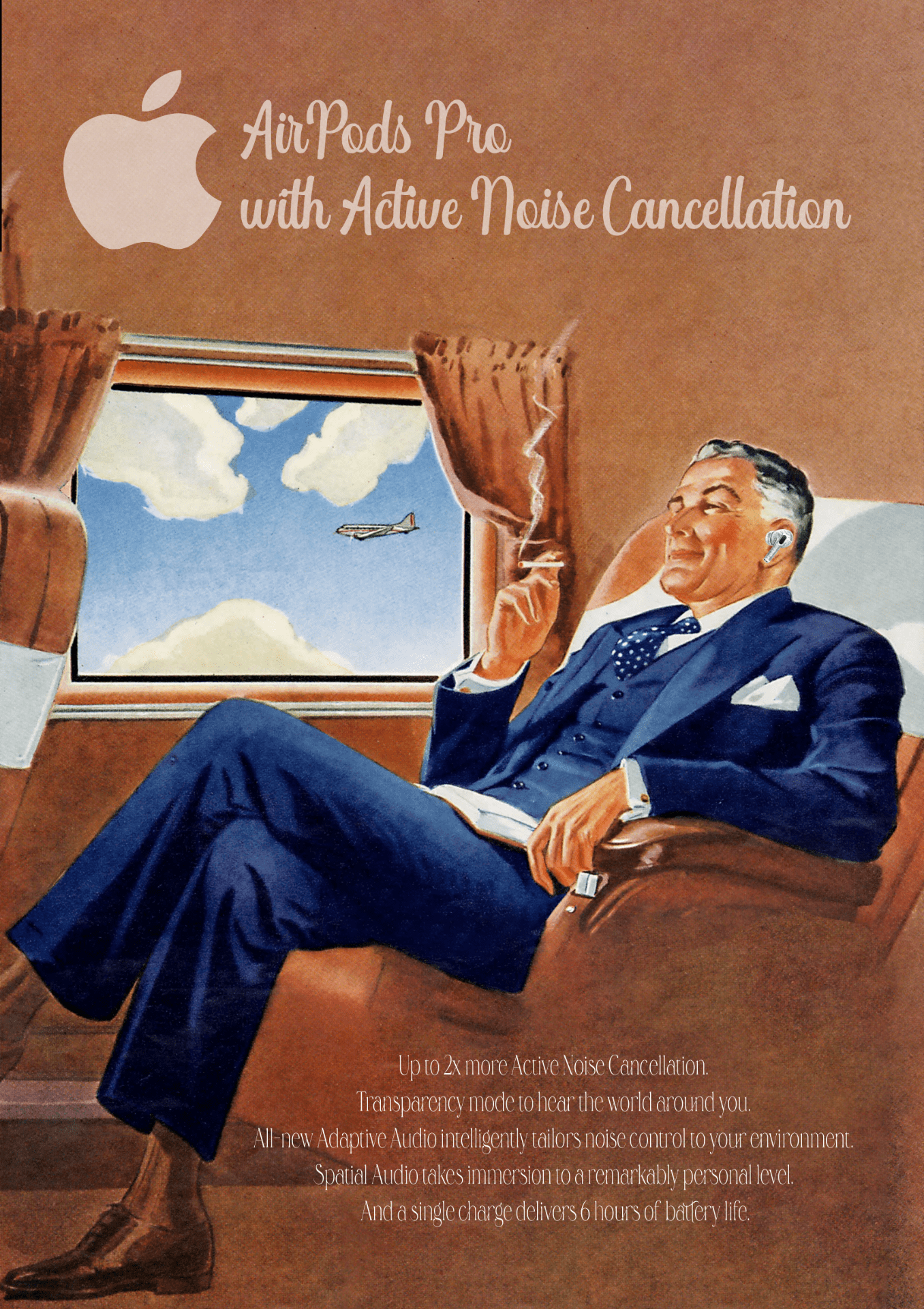
Entertainment In Your Ears Anywhere
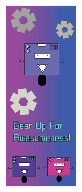
Robos For Kids
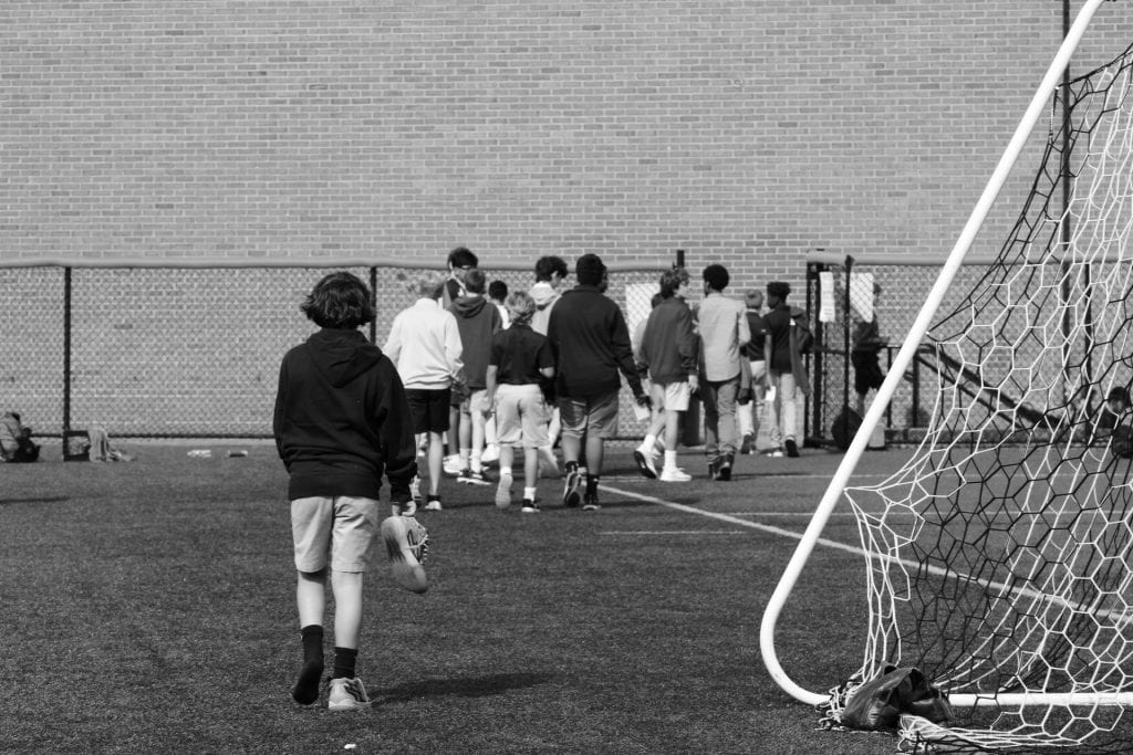
OP’s Exposure
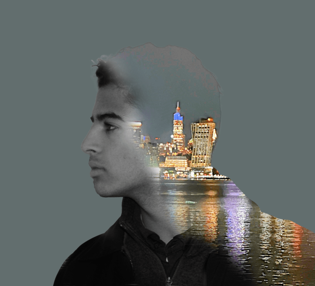
For my first photo I wanted to get the city behind Aryan coming from his head. The subject in my photo is my friend Aryan and the city is Chicago at night. I think I did a good job getting to from my head onto photoshop. I feel like I could of made it look a little smoother.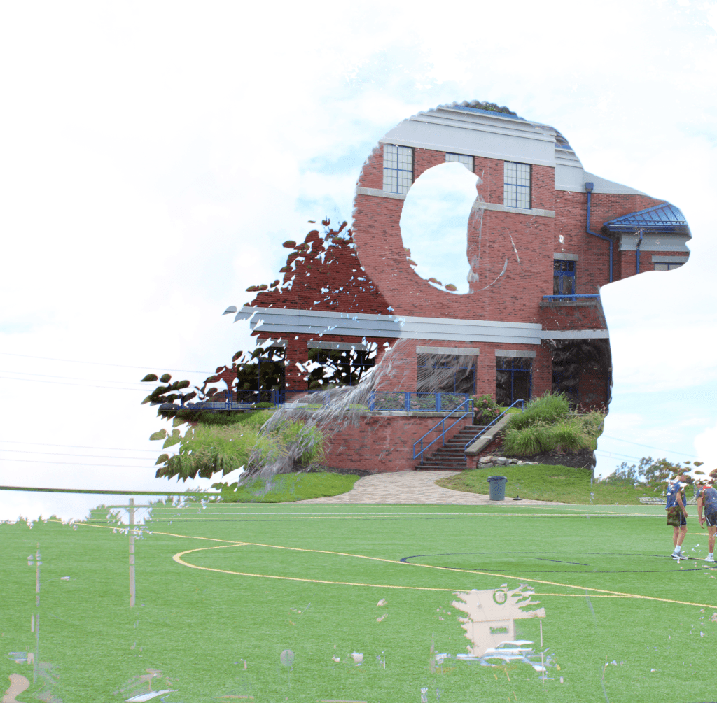
I tried to get the OP Ram overlapping the School. These were both taken at op and they are the OP Ram and DeGaeta. I feel like it turned out pretty good. I feel like I could have gotten the ram to be dominant in the final image.

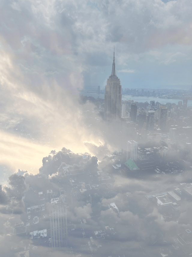
I wanted to make this image like you were above the city looking down through the clouds. This Photo was taken in New York and the clouds was taken in Texas. I feel like it turned out amazing and the best one out of the 3. I feel like I could of gotten the skies to mix better.
Double Exposure
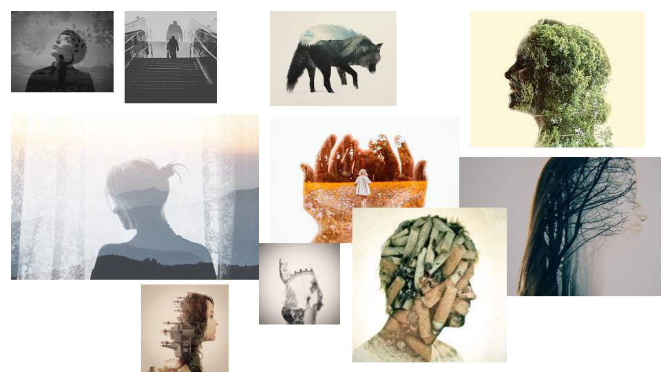 These pictures inspire me on what i want to create. I love the Nature in Double Exposure pictures. And thats what i want to incorporate in my work.
OP Cityscape
F&P

The Principles of Design

- A weakness I have is not being able to take Photos of everything I see. And needing to wait to see something Perfect to take a picture of. The Strength that I have is when I take that perfect picture it’s a really good photo.
- I would improve on taking photos of everything no matter if it’s good or not. Being able to take photos of everything makes it easier to get all the principles done faster. Also they might actually be good photos.
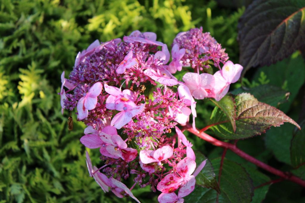
- Emphasis-Isolation photo I took really shows how lonely that flower is. All green around it and it’s the only pink flower in that spot. It’s kind of a calm feeling.
- Emphasis on the Contrast between Hot and Cold colors are really cool. Trying to take photos of that Principle of Design was eye catching ,literally. I feel like it’s the Best Principle of Design to take without props.
- I would like to try to take photos with props. Using props is very interesting. You get to choose how everything is set up.
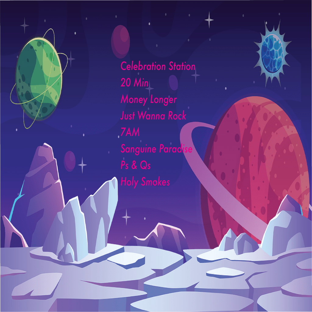
Money Longer
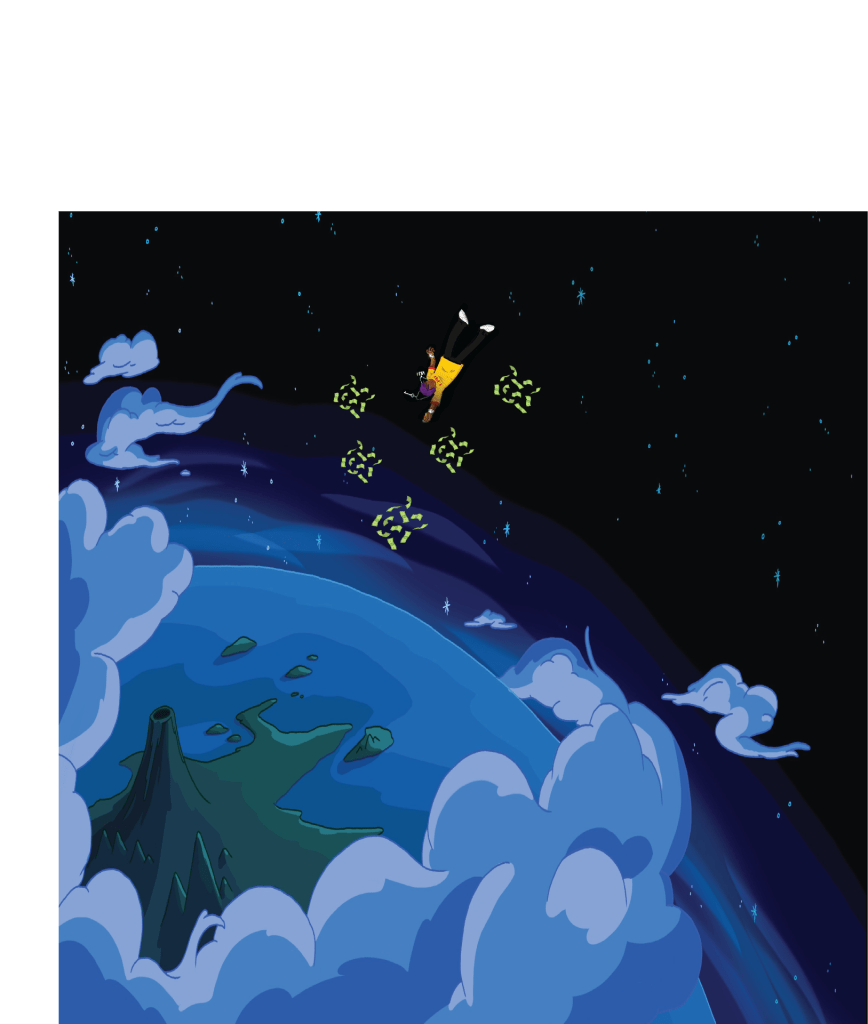
My inspiration for this piece of art was space and the galaxy. I find a lot of interest in space and I find it really cool. Any album cover I could find with space was my inspiration for my art work. Lil Uzi Vert was another big inspiration for my work. He is one of my favorite artists and his album covers are really amazing.
I used Photoshop and Illustrator to do my work. The contrast in my album cover was very dominant. The contrast in colors in my front and back were very different. The alignment on the money and character were perfect to me and in the spot they should be. The proximity of everything was good. Everything was spaced out.
I intend for the audience to see the person falling to Earth. I want the experience while they’re listening to the album to be hype and happiness. You gotta be in that mood and just chill to like all the songs. It’s like a party/driving album which I like alot. I want them to think about the good times and the mood that’s going on around them.
The most successful aspect of my work was making the album cover pop out and something lil uzi would want in an album cover. I think i did a good job making it and it looks good to me. I like it and think the songs on it make it stand out even more.